• Market/Competitor Research
• Strategic Marketing Plan
• Brand Identity
• Website Design
• Public Relations
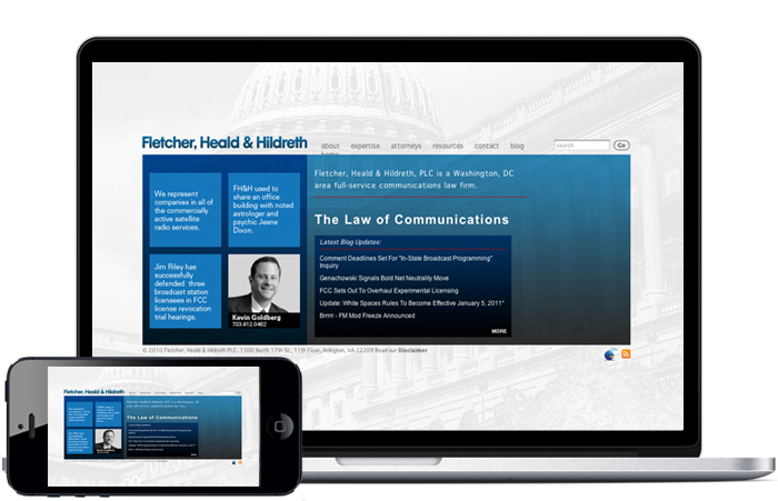
The Ad Agency was hired to design and produce the new Fletcher, Heald & Hildreth logo, brand and website. The new site is slick, attractive, easy to navigate, informative, and all the good things that a law firm website should be. It introduces Fletcher, Heald & Hildreth, and lets you know who they are and what they can do.
You can read about the current team
of lawyers and the firm’s history. (They’ve
been around for 74 years, almost as long
as the FCC.) On the home page we’ve
included interesting factoids about each
of the attorneys. One factoid per view—
just hit refresh to see a different one.
Once you get started, it’s hard to stop—
like
eating peanuts.
It’s got nice photos of everyone. We
debated what the photos should look
like. Should they pose in faux meetings
or courtroom dioramas, looking brutally
hard-nosed yet supremely reasonable?
Should they emphasize their softer
side, dressing up in recreational garb
(wetsuits? cycling outfits? camo?)?
Should they pose in non-office settings
looking tanned, rested, and ready?
We went with down-to-earth, the way
they really look—except in person they
are in
full color.
The website has links to their blog and their informative publications, the Memo to Clients and FHH Telecom Law. The front page also includes the headlines from their most recent blog postings, in the unlikely event that you haven’t seen them elsewhere.